I've been seeing ads for Tailor Brands all over my Facebook feed, promising simple custom-made logos for just $24. As a design professional who knows how much care and research can go into logo design, I was naturally skeptical. After all "if it sounds too good to be true, it probably is" and "you get what you pay for" are old adages for a reason. So I decided to take the interface for a spin, so you don't have to. Let's make a logo!
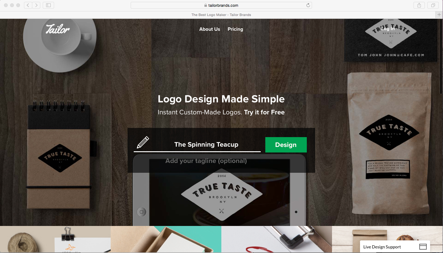
First things first: you have to enter the name of your business. I'm using The Spinning Teacup, a side brand I have for t-shirt designs that empower and encourage little girls. (Zazzle shop here: www.zazzle.com/thespinningteacup) Click "Design," and you're on your way.
Next you're instructed to describe your business, so the software can "create better designs". I'm not sure what a software algorithm can do with this information other than mine it for keywords. I suspect this step is more to make the user feel like they're getting a more custom option than actually informing the software's design process. So I'll test that theory:
Everyone knows that San Antonio has the best breakfast tacos.
The next step is deciding what type of logo you want: icon based, name based or initial based. Just can't decide? That's ok, you can select more than one type. I chose to combine icon based and name based.
Since I want an icon based logo, the next step is to find an icon. Naturally, I'm going to go with a teacup.
There's more teacup options than meets the eye here, you just have to scroll down in the icon box.
Hold up, these icons look familiar. This icon preview looks almost exactly like that of The Noun Project, a wonderful royalty-free icon initiative. Curious, I headed over to The Noun Project and searched for "teacup."
Yep, Tailor Brands is sourcing its icons from The Noun Project. This is not a bad thing in and of itself, as The Noun Project provides high-quality icons. I've used them in many non-logo projects myself. The catch here is two-fold. First, since these icons are royalty-free, lots of people could be using the icon you select for their own stuff, and there is nothing you can do about that. This has the potential to dilute your brand. "No problem, I'll just trademark my logo!" you say. That leads to catch number two, straight from the FAQ page of The Noun Project:
Can I trademark an icon to use for my business logo?
You may not trademark any unmodified icons you have downloaded from the Noun Project. The designer of the original icon holds all legal rights to his or her own work.
The Noun Project can not provide legal advice on trademark or copyright, however it is our understanding that if the icon you've chosen for your logo is modified enough to serve as part of the final design, you may be able to trademark the logo itself. We suggest that you reach out to your attorney for specific legal advice.
So any icon you select for your logo via Tailor Brands is not able to be trademarked. That's problematic on many levels, especially if you want to use your logo long-term as your business grows. And who doesn't want to do that? Well, for the sake of this little experiment, let's pretend I don't care about trademark-ibility and soldier on. Pick a teacup, any teacup.
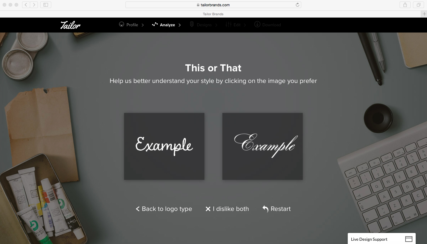
Teacup icon chosen, the interface now wants to better understand my style. I'm a little confused, should I go with my personal style, or the style that best fits my business and target audience? Those are definitely two different things. Let's assume I'm keeping my business in mind and click on the left example.
Um, ok. I don't think either of these work, so I'll say I dislike both.
Better like this or better like this? I'm starting to feel like I'm at the optometrist's getting my eyes checked.
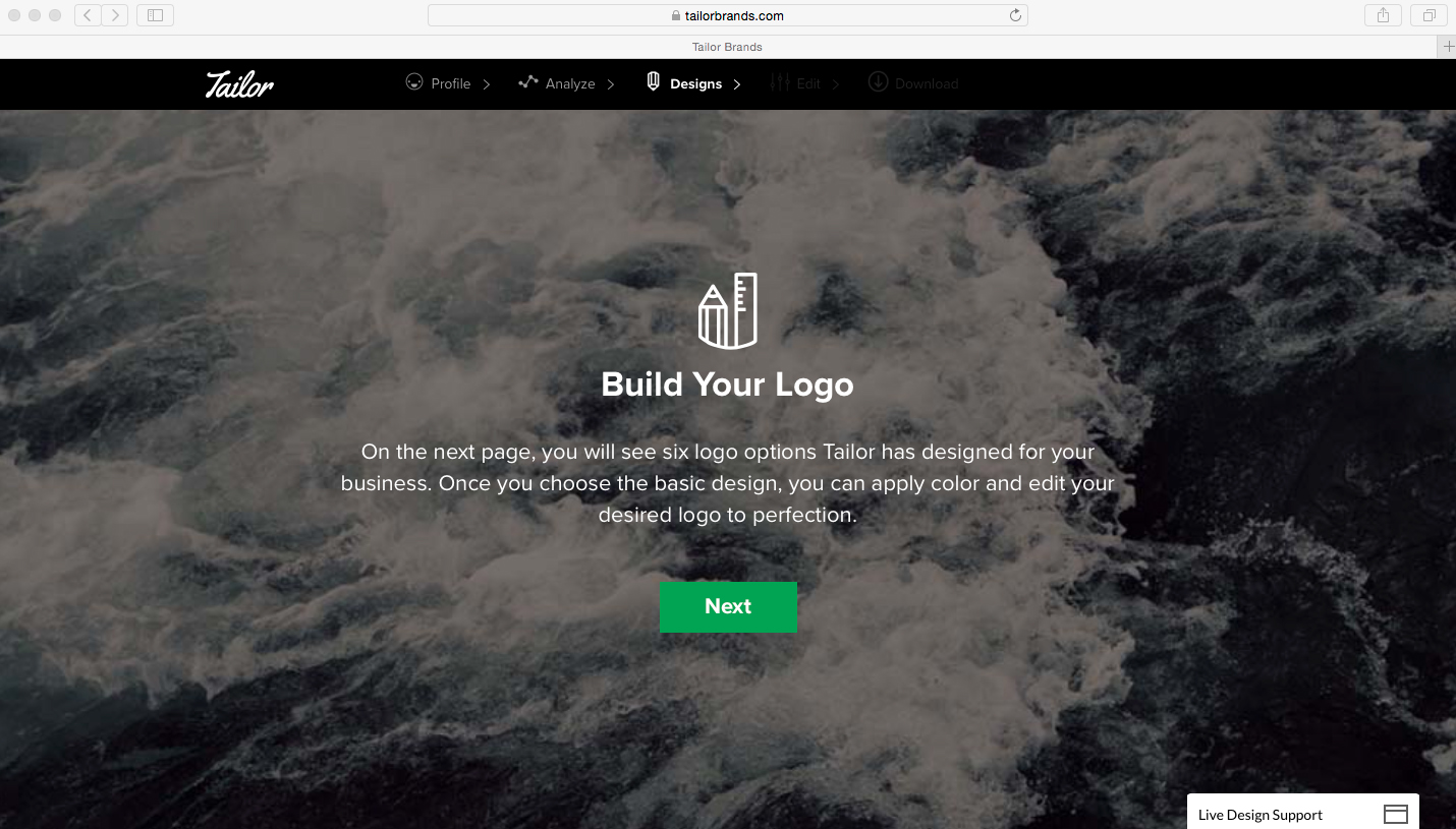
Another This or That to pick from. This goes on for seven screens, but I'll spare you the remaining screenshots. Just when I think it's never-ending, up pops a loading progress screen that tells me Tailor Brands is making my logo options. It says that it's scanning relevant typefaces, aligning logo elements, customizing color palettes, etc.
Everything a pesky person designer takes days or weeks to do. Who's got time for that?
Ok, now we get to see the logo options, right?
Not so fast!
Before you can even see what the software has come up with for you, you'll have to pony up your email address and register with the site. It's free, but now you're on their mailing list. I'll bite, because this is for science. Having paid up with my email address, here are the first three options.
The first three options. The one on the far right reminds me of the Nintendo logo.
And here's the final three options:
I notice that the software has served up two "initial based" options, even though I didn't ask for them. In fact, of the six options it originally promised me, two are icon based, two are name based, and two are initial based. Again, I specifically only selected icon and name based options. There are also type options present here that I said I didn't like in the "this or that" process.
Let's see what we can do with the "Edit Your Logo" function.
Here we can change up the font, layout, icon size, color, and other tweaks. Wait, I thought the software was supposed to do all of this for me based on what I told it about my business. Oh well, at least we get to play designer! There's even a friendly support agent to help me out if needed. (I closed that popup, I'm already in deep enough.)
I changed up the layout, fonts and color. Oooooh, a free sample! Who doesn't love samples? Gimme.
No freebies here, folks. While you can in theory put this transparent png file on stuff to see what your shiny new logo will look like on it, the watermark makes it really tough. Ok, what happens when you want to pay up? Let's click "buy".
Turns out that $24 only buys you a high-resolution png of your logo. If you want a vector (fully-scalable) version, that's going to run you more. But you're a professional, right? Let's get some letterhead and business card designs too.
You get to choose from four pretty generic templates. Not what speaks best to your business.
Ok, I'm done playing around on here. Not only does this software not take your unique business characteristics into consideration, the icon choices aren't able to be trademarked or customized (in this case, there is no way to introduce a sense of "spinning" on our teacup), and the overall design feeling is just a couple of steps above what you can accomplish in Microsoft Paint. Generic templates result in generic design.
Here's a side-by-side of the final Tailor Brands logo versus what I actually designed for The Spinning Teacup. Which one looks more professional and memorable? (That's a rhetorical question, folks.)
Even when you're just starting out, it's so important to have your brand reflect the professional company you want to be. You only get one chance to make a first impression, so make sure it's as sophisticated and unique as your business is.


